
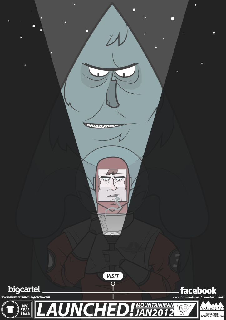
What's the inspiration behind this design you ask? Robots are pimp. Nuff said...... Seriously that's all. Thanks for reading.
 |
| Screenprint of the design |
Ok, besides being really cool and awesome, I like the idea of having several perfectly functional humanoid-robots respecting and doing as I demand- but unfortunately we live in reality and not the 50's utopia of the future. How I wish it was so..... Sorry for the unneeded cussing, but I really want a mother-flippin robot. Seriously is that too much to ask......?
 |
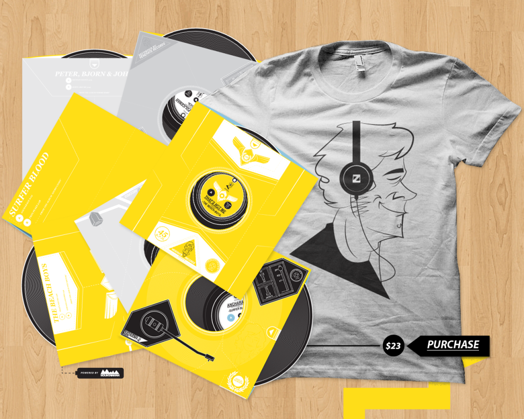
| I make posters......... |
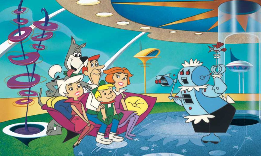
Besides my own selfish need for a metal comrade, I also think the proposed uses for them are really awesome. Sure we have robots in many forms now, but not in the way that reflects human-like abilities or thoughts. They're also exclusively used for commercial purposes or brand awareness. However, some of the robots that are currently being developed in Japan are not just for the manufacturing needs of companies, but rather to eventually take care of the rapidly ageing population and those who can't take care of themselves. These companion robots are what I really want to see in the near future, but unfortunately where decades away from seeing them common place. To be more specific about two decades. Don't keep your hopes up though, to many dreams have already been crushed with the supposed hoverboards of the near future. To many......
 |
| Elektro by Westinghouse |
Why 1937? It was chosen as Elektro was constructed in 1937 by Westinghouse Electric Corporation. Elektro is considered to be one of the very first American robots. It could smoke cigarettes (among other things) and had a robotic-dog companion named Sparko. An aspect of Robots that I like is the vast amonts of visual interpretations- some are human-like while others are a lot more mechanical and heavy in form. Elektro was limited to technology of the time, as you can see from the arms and it's limited movement- but it didn't stop them from making it it look life like or trying to give it human qualities such as speech. Although, this was limited to 700 words through a record playing. What happened to Elektro? He became a D-list celebrity and then dismantled by the CEO of Westinghouse when presented as a gift many years later. I will forever remember you Elektro and your short stint at fame- his robotic antics will never be forgotten.
 |
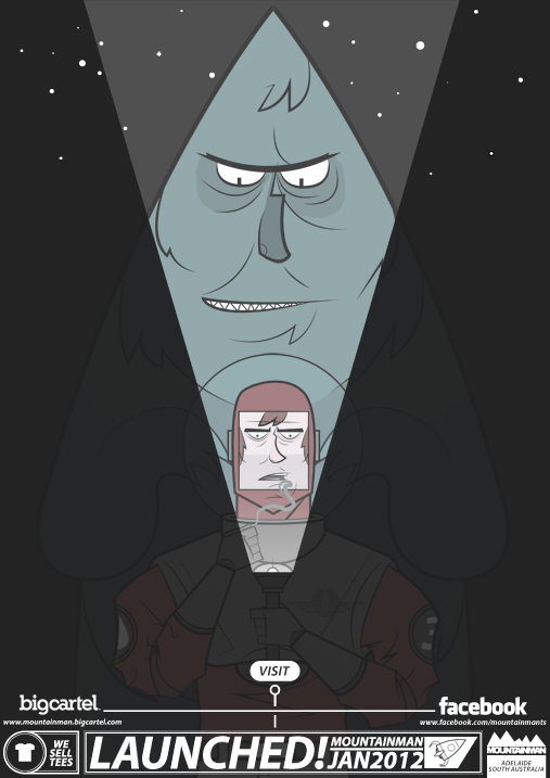
| Screenprinted tee. |
Thanks for reading.
The next article will either be about one of the new designs ( Minor Keys and Stay Manly) or the development of The League of Manly Merman.


